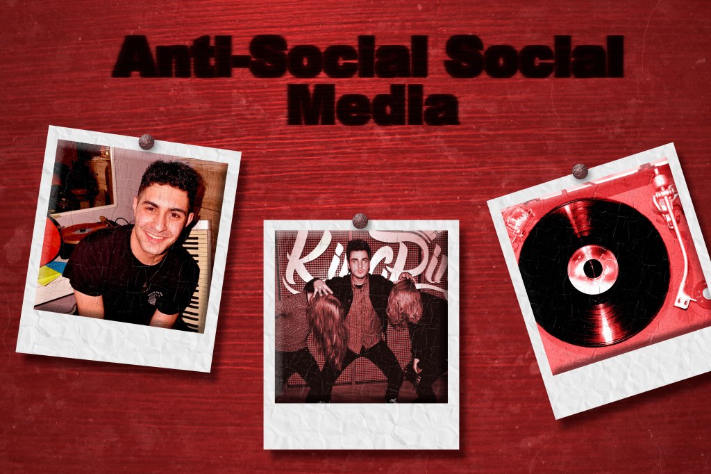
In my initial draft, I essentially created a blog/YouTube banner with three different photo prints of me, my friends and a record player. I chose these photos, just to show who will be involved with the channel and what will happen on the channel which would just be showcasing their music and just in general us having fun with different internet trends. First, I took a photo of a bedframe and colorized it to make it red, so I could use it is a background. Then I took the three photos, retouched them and colorized them to a shade of red. Then I took these pictures and put them on three white squares to make them look like photo prints. After this, I took the name of the blog/YouTube channel and overlayed it on the wood to make it look burnt in. Some critiques that I received was that the title was a bit illegible and the prints appeared to be floating and lack interaction with the actual background. How I solved the first issue, was I simply took the original text that I used to overlay with the background, and made it slightly more visible, leaving it with an opacity of 50%, so that it makes the text retain it’s shape, but does still look burnt into the wood. I took a few different approaches when making the prints look more realistic. First, I made a drop shadow on all three. Then I created a crumpled paper pattern and texture. I added the pattern to the white squares and the texture to the pictures, having different settings for each, to hopefully make them look more realistic. And lastly, I took three nail heads which I just found a picture of online, then added them to every photo, to make the look like they are stuck on the background.