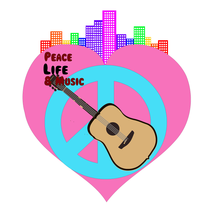
The following image is a logo for a music festival that I have come up with called Peace, Life & Music. I got inspiration for doing this specific type of logo from a DTC class I took where we learned about different logos from the 70s, in regards to music festivals. What interests me about them is the amount of color that they use, verses what is popular today, which is often much more minimal. The amounts of color that were permitted, allowed artists to be much more maniacal when it comes to their art. Not that the art was insane, but it often conveyed psychedelic traits. For example, below is an image that I found on Behance from Elio Moavero who made the logo for That’s 70’s Fest 2018.
Clearly, the logo is very intense. There are many colors and images that represent the 70’s era of music. This logo specifically is actually mimicking choices artists made in the 70s when it came to their typography, which is often warped and bubbly. So for my text I decided to go with one titled Magical Mystery Tour from 1001Fonts. https://www.1001fonts.com/magical-mystery-tour-font.html
For the objects I decided to be quite direct. I used the universal peace sign and heart sign to convey peace and love. I then used an acoustic guitar, to ensure the understanding that it is a music festival.
Ideally as well it would be at a venue in Portland, so I added buildings on top of the heart and made them the colors of the rainbow. I did this for multiple reasons. Firstly, I wanted my logo to have more color. And second, I wanted the logo to reperesent an aspect of Portland. Specifically, the large LGBTQ community that we have in Portland; the colors are mimicking the LGBTQ flag
I did not use the exact colors though, so it may not convey the message as well, however I believe it does an adequate job.
As for the tools that I utilized in illustrator. I first used the image trace tool, to trace an acoustic guitar, which can be found here.
I then changed the coloring a bit and also added my own guitar strings, using the rectangle tool. I then traced half of a heart and then copied and reflected it to make it even. For the peace sign, I simply Image traced it from the following image, as I was finding it difficult to make on my own, while having even alignment. The image is linked below.
Ad for the building, I simply used the rectangle tool, then colored them using the color picker.
