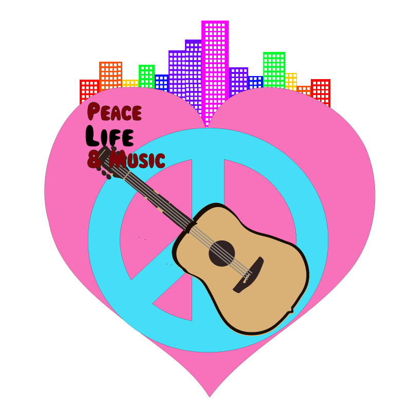
Before 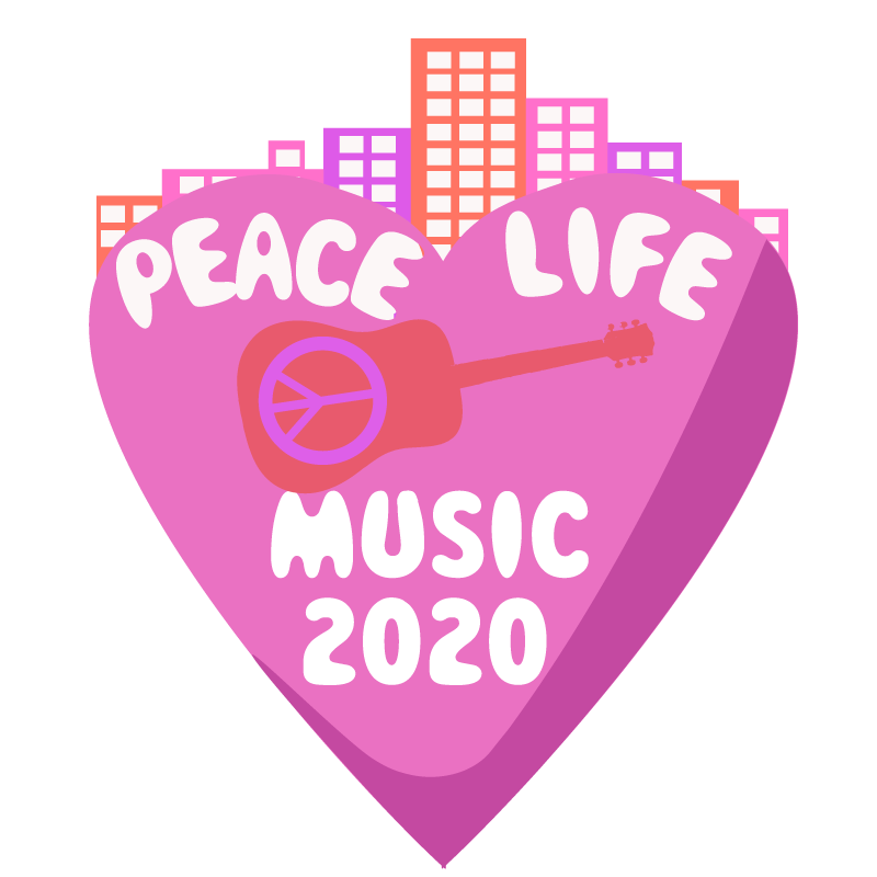
After
Above you can see the before and after of a logo I made for a music festival that I have come up with called Peace, Life & Music. I got inspiration for doing this specific type of logo from a DTC class I took where we learned about different logos from the 70s, in regards to music festivals.For example, below is an image that I found on Behance from Elio Moavero who made the logo for That’s 70’s Fest 2018.

This logo specifically is actually mimicking choices artists made in the 70s when it came to their typography, which is often warped and bubbly. So for my text I decided to go with one titled Magical Mystery Tour from 1001Fonts. https://www.1001fonts.com/magical-mystery-tour-font.html
For the objects I decided to use at first, I used the universal peace sign and heart sign to convey peace and love. I then used an acoustic guitar, to ensure the understanding that it is a music festival. Ideally as well, it would be at a venue in Portland, so I added buildings on top of the heart and made them the colors of the rainbow. I wanted the logo to represent an aspect of Portland. Specifically, the large LGBTQ community that we have in Portland; the colors are mimicking the LGBTQ flag

After receiving criticism I needed to change quite a bit. One of the big things that I like about the original logo was that the layout of everything in my logo works, but the color scheme was very chaotic which made the objects not mesh together very well. So what I did to solve this problem was I took some advice from Bonnie Mcrady and found a appealing color scheme from the color wheel that Adobe has on their website to help people choose color schemes that compliment each other well. I will have the color wheel linked below. It was clear from my comments, that the detail of the guitar was not meshing well with the simplicity of the rest of the objects, so I filled in all the vectors to be the same color to act as a silhouette rather than a clear object to avoid distracting from the typography. Next the typography that I used lacked clarity and the ability to be seen from afar. So rather than just having the text just curled up in the right corner, I used the pathfinder to make a clipping into the heart for the text. Another thing that Bonnie suggested I do is mesh the peace sign and the heart together however I wanted the text to be more of a focus, because it was so out of place before, so I took the peace sign and put it in the center of the guitar to act as a soundhole. I do know that the rainbow color I chose before had significant meaning in regards to the Portland LGBTQ community, however, I felt as though it was a bit distracting from the logo, so I just added the same color scheme, to just give the logo a urban tone.
-Ronnie Yaacoub
https://color.adobe.com/create
